For over two decades, Resales Online was a trusted tool for real estate agencies, but its UX remained outdated. As the Lead Product Designer, I led a full-scale redesign through UX research, surveys, and collaborative workshops, shifted stakeholder focus from minor tweaks to a complete new product, Resales Plus
Resales Online struggled to keep pace with contemporary user expectations. Its outdated UI and fragmented workflows made navigation difficult, leading to inefficiencies. The absence of a user-centered approach in past iterations frustrated users, highlighting the need for a modern, structured experience.
The goal was to merge modern usability standards with familiar functionalities, ensuring a smooth transition for existing users. By streamlining workflows, improving productivity, and enhancing user interactions, Resales Plus redefines how real estate professionals manage daily operations efficiently.

To address these challenges, I began by conducting a comprehensive product audit, evaluating each feature’s purpose, usability, and relevance. This helped us identify redundant or ineffective functionalities that could be streamlined or eliminated. To gain deeper insights, we conducted UX research, including quantitative surveys and qualitative interviews.
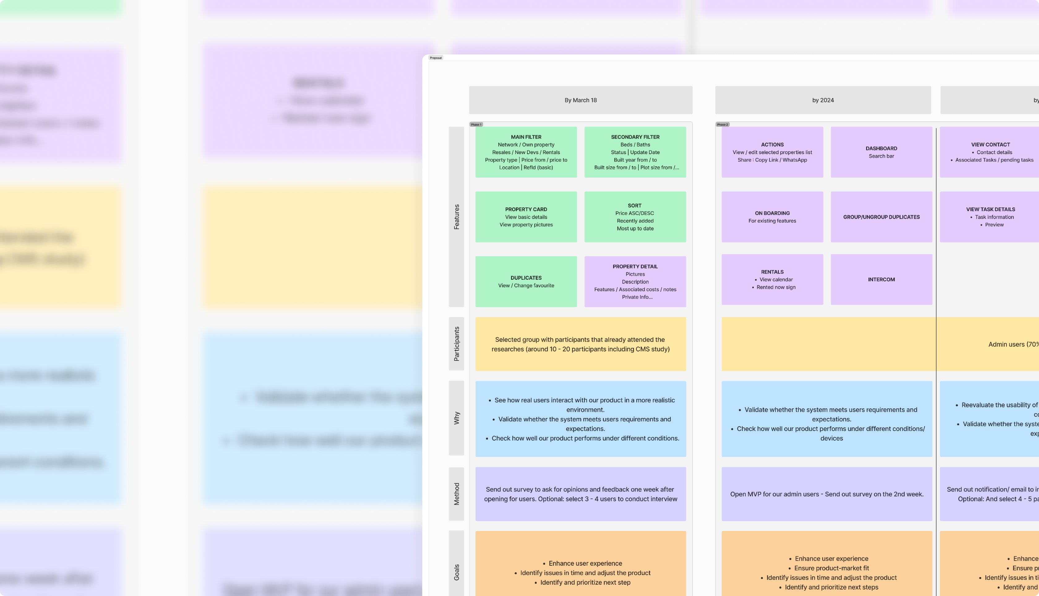
Following our research, we facilitated collaborative workshops with stakeholders to redefine the Information Architecture (IA) and user flow, this also helped our stakeholders feel more involved in the design process that they were initially not familiar with. Through iterative brainstorming sessions, we identified and prioritized core features, ensuring they were both useful and accessible. This process was followed by the development of wireframes, high-fidelity prototypes, and interactive mockups, which were continuously refined based on user feedback.
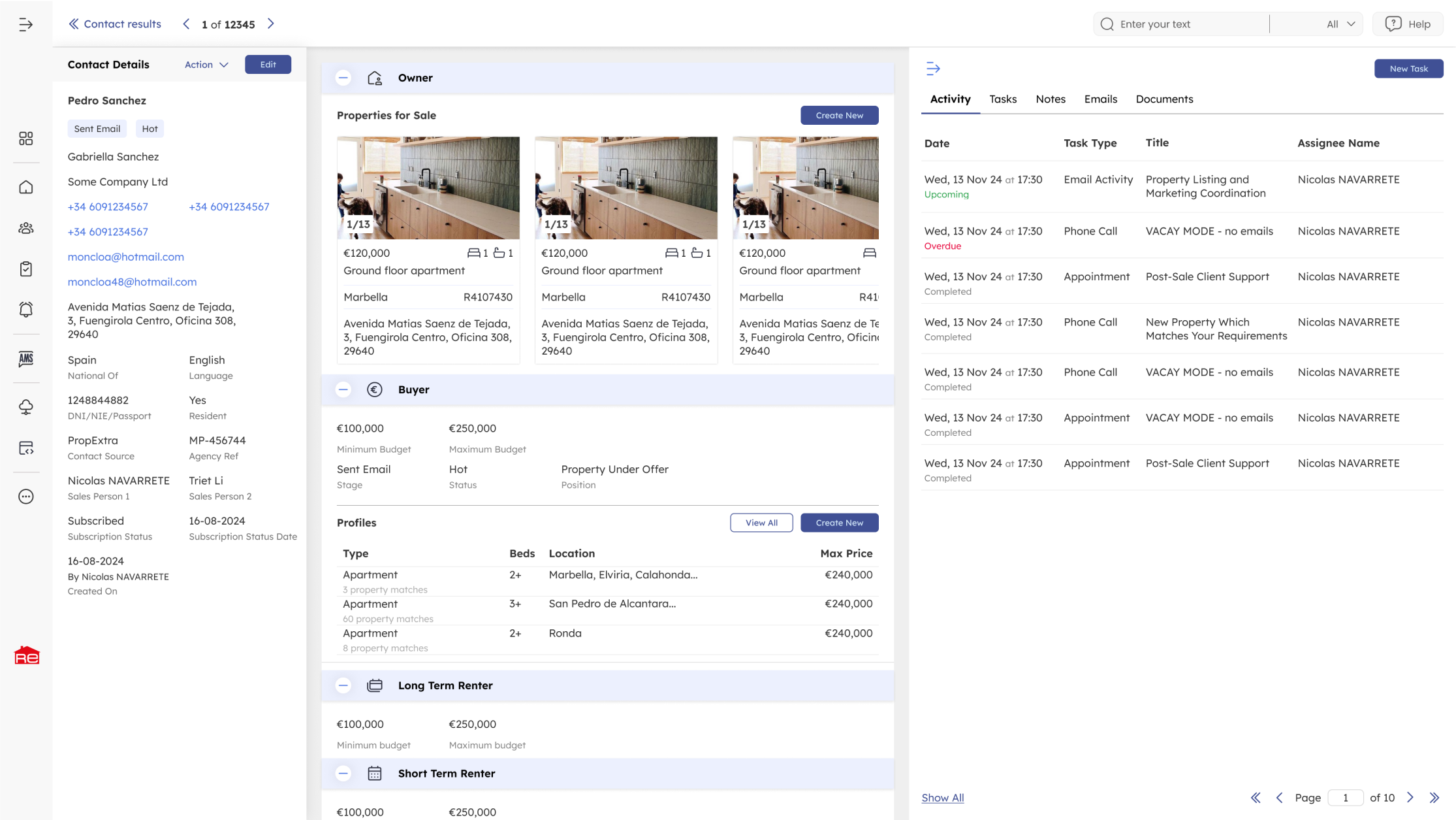
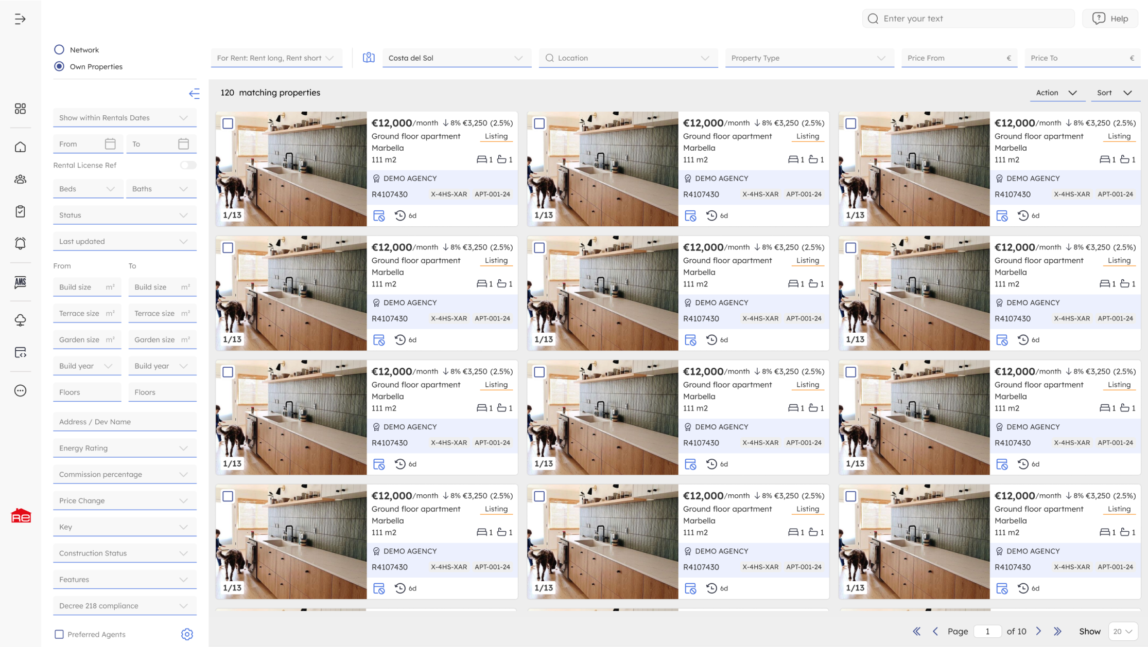
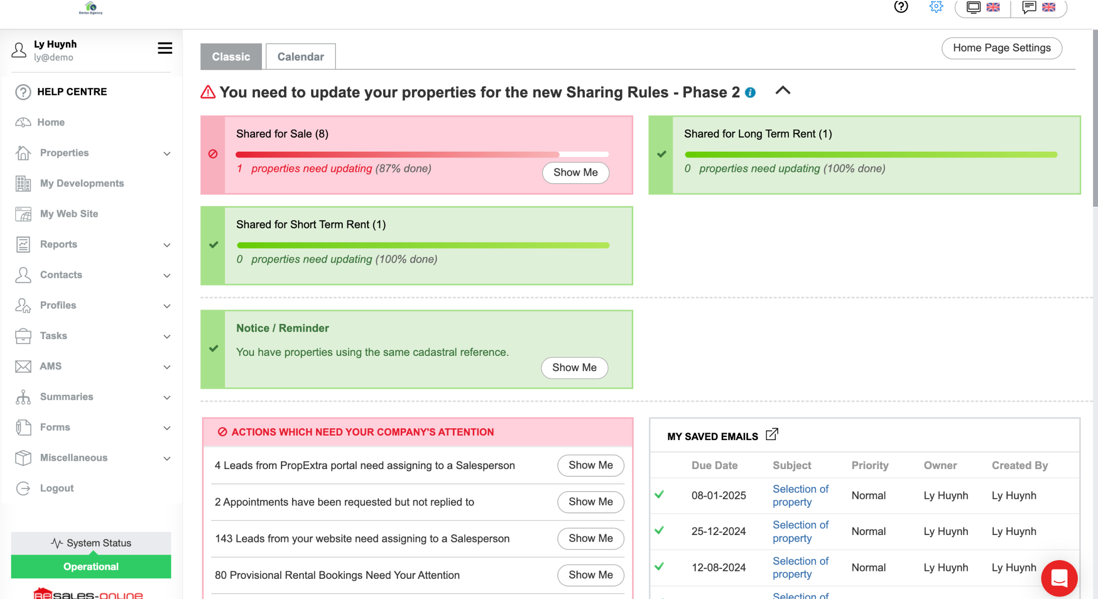
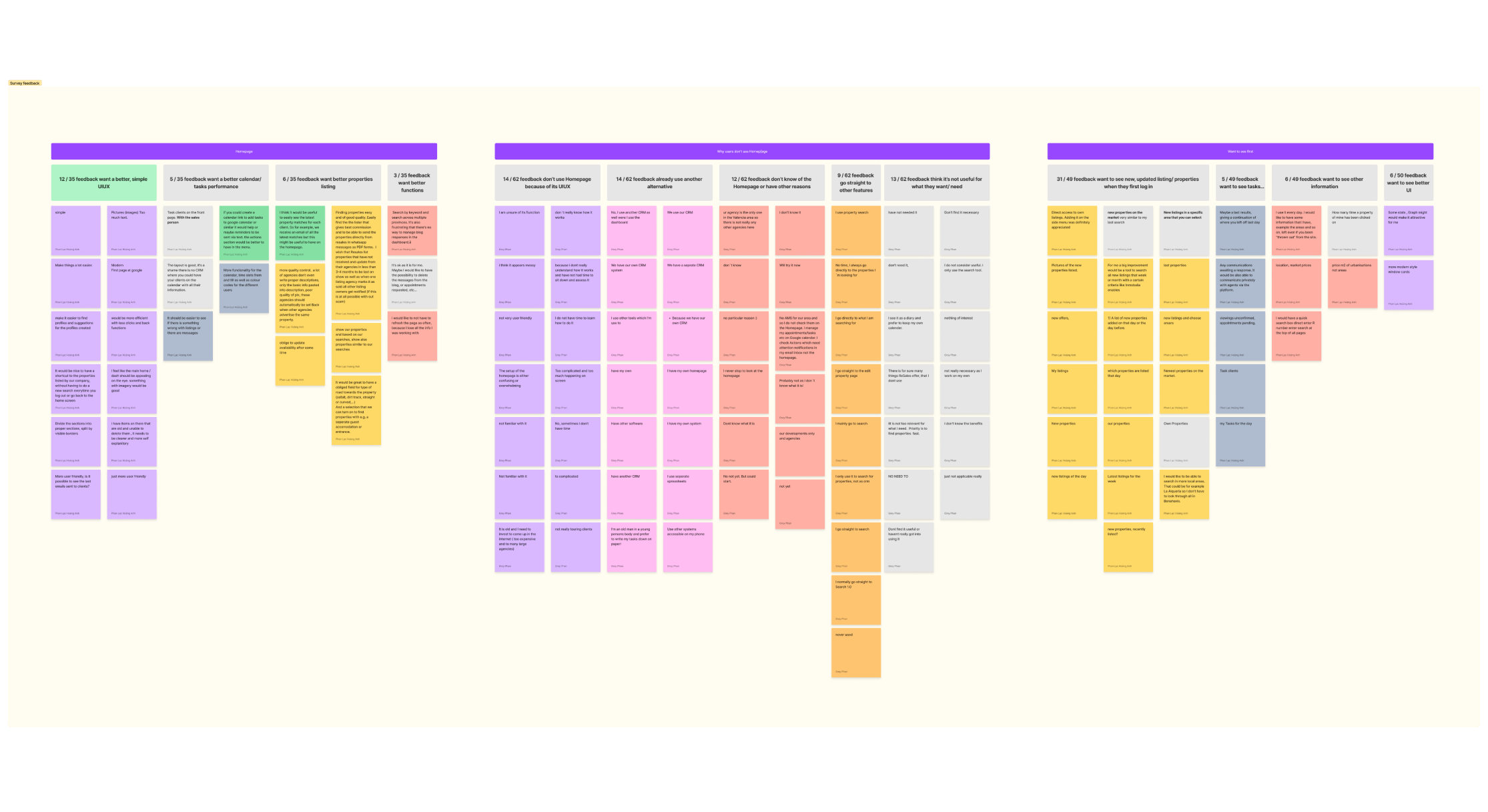
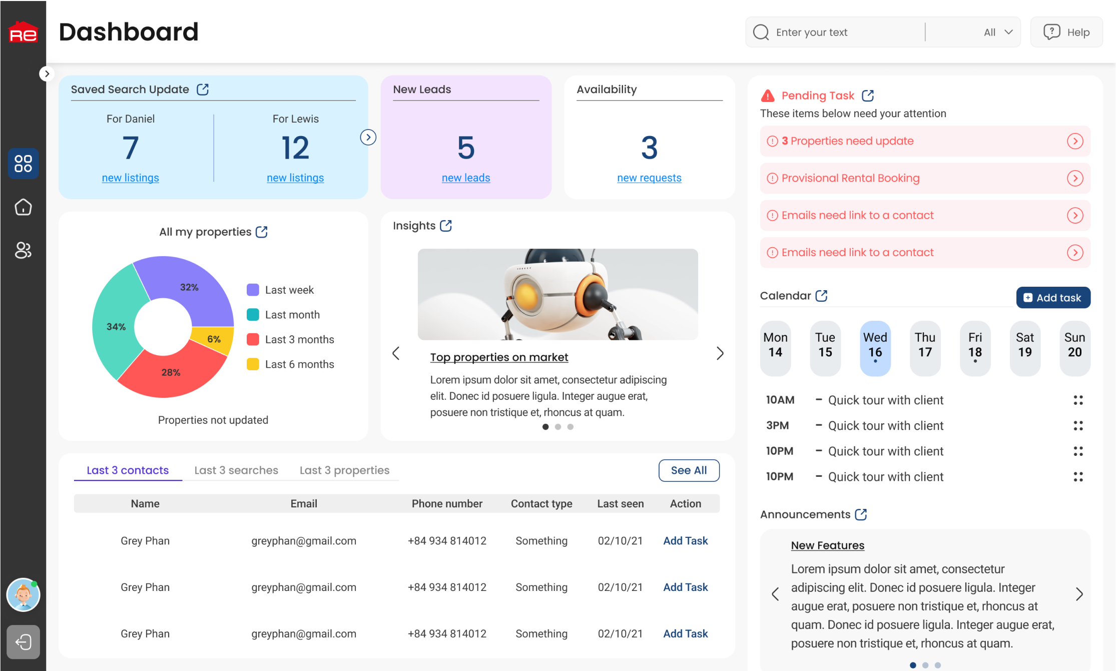
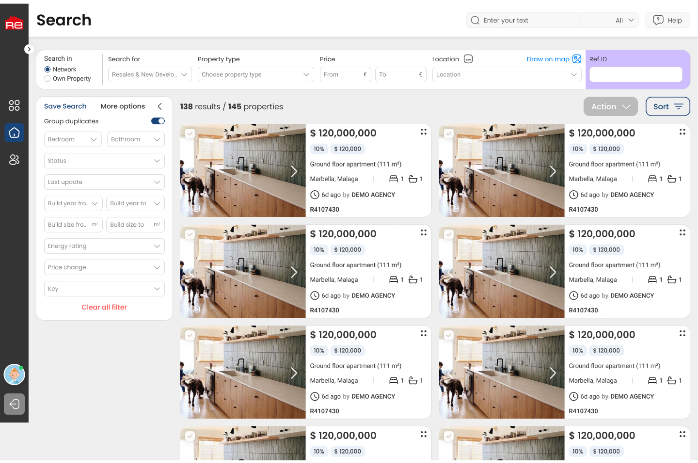
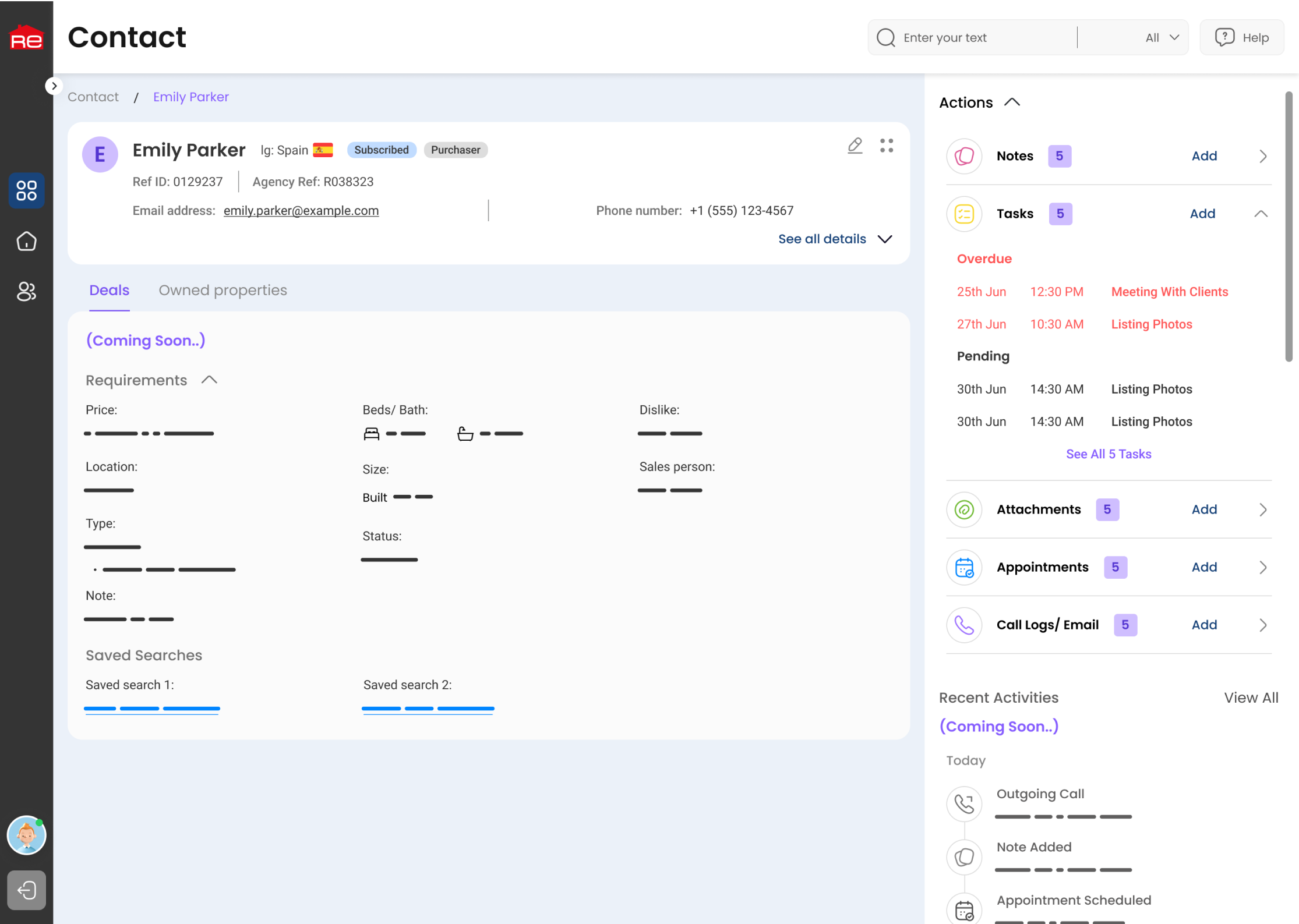
We conducted user surveys to collect feedback from existing users, focusing on identifying their biggest challenges and most frequently used features. Through this research, we found that the Dashboard and Search functionalities were the most critical areas requiring improvement. The Dashboard lacked clear data visualization and workflow efficiency, while the Search experience was hindered by complex filtering options and an outdated interface.
Once identified the primary focus areas, I conducted collaborative brainstorming workshops with stakeholders, product managers, and engineers. These sessions were instrumental in restructuring the information architecture and redesigning user flows, by using white boarding techniques and UX mapping tools such as FigJam. We also prioritized feature development based on feasibility and user impact, ensuring that the redesign addressed both business goals and user needs.
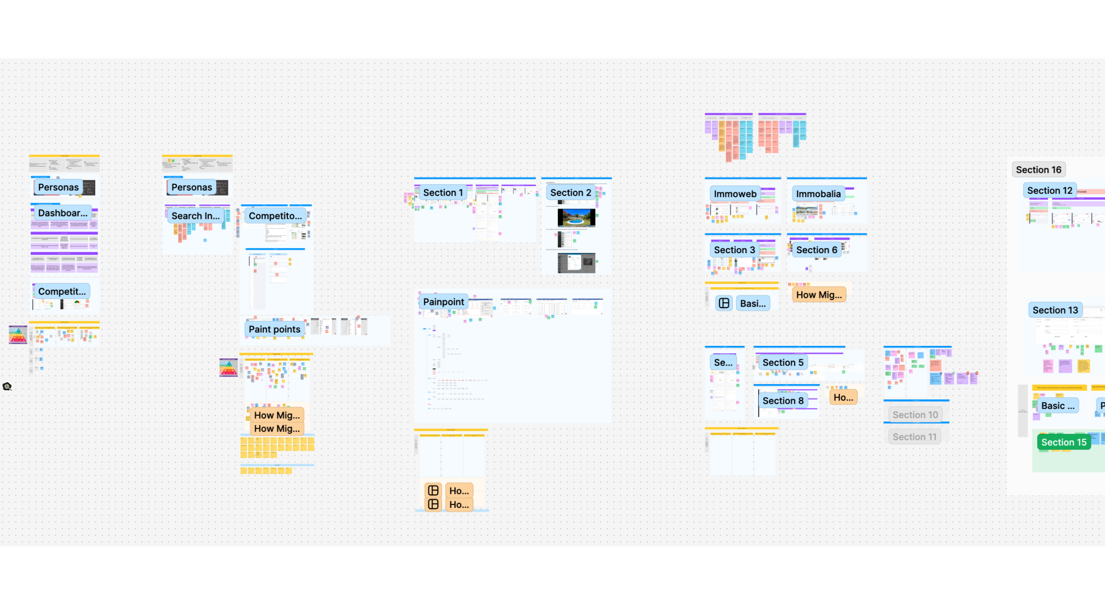
With a clear direction established, I started designing wireframes in Figma, focusing on the restructured Dashboard and Search experience. Low-fidelity wireframes were shared with internal teams for early feedback, allowing us to refine layouts and workflows before progressing to high-fidelity designs. The final high-fidelity UI incorporated a modern visual style, improved accessibility, and refined interaction elements that made navigating the platform seamless.
To validate our design decisions, I developed interactive prototypes and conducted usability testing sessions with selected users via video calls and Figma prototypes. Participants were tasked with real-world scenarios, such as searching for properties using specific filters and managing listings from the new Dashboard. These sessions provided valuable qualitative feedback, highlighting areas of friction and opportunities for further refinement. Based on the findings, we made iterative adjustments to improve clarity, streamline workflows, and enhance the overall usability of Resales Plus. The final product successfully bridged the gap between user expectations and business objectives, resulting in a more efficient, intuitive, and user-friendly experience for real estate professionals.
After completing usability testing and gathering extensive user feedback, we collaborated with stakeholders to ensure the refined design aligned with both business goals and user expectations. We analyzed areas where user needs and business objectives intersected, ensuring that our design adjustments not only improved usability but also supported long-term growth and product adoption.