Edumall is an online learning platform offering professional skills courses. Since its inception, Edumall has operated on a one-off purchase model, allowing users to permanently own the courses they buy. However, with the surge in demand for online learning during the COVID-19 pandemic, Edumall's stakeholders aimed to make education more accessible. This led to the launch of a new subscription model, Edumall Plus. With Edumall Plus, users can pay an affordable monthly fee to access over 200 courses across various categories—an ideal option for those looking to explore or transition into new fields of knowledge.
Many e-learning platforms have adopted a subscription-based model, but Edumall’s users have long been accustomed to a one-time purchase system. Our challenge as designers and product owners was to introduce a hybrid model that combined both approaches, while smoothly guiding users through the transition to the new subscription model.

After careful consideration, we decided to maintain the existing homepage design for Edumall, while adding subtle touch points to direct users to a dedicated landing page introducing the new subscription model. Additionally, we designed three core user flows to support this transition:
- Discover and Sign Up
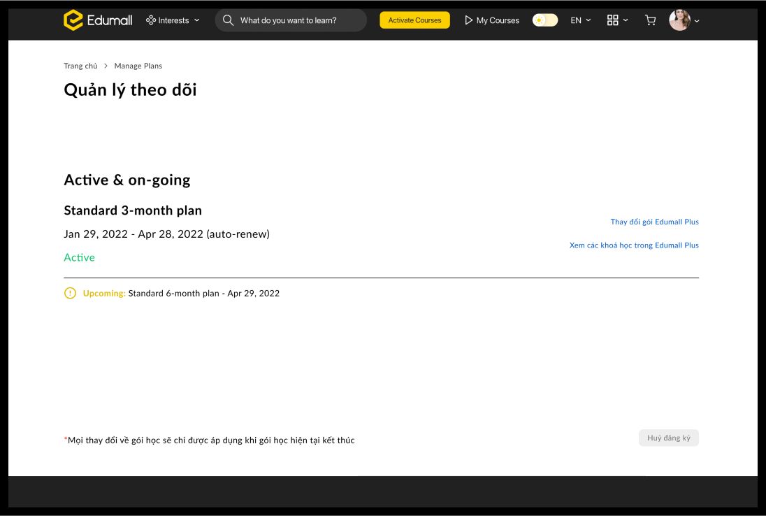
- Manage Subscription Plans
- Manage Subscription Payments
These flows were crafted to provide a seamless experience and help users navigate the new system with ease.
@2x%20(1)%201.png)
Once the landing page and high-fidelity mockups were ready, we conducted two rounds of user research. The first phase involved a UX-focused group interview, led by the Marketing team and supported by the Product team, to define our target personas. This was followed by usability testing, which I personally oversaw. I began by preparing the UX research script and recruiting six participants who closely aligned with the personas we had identified earlier. This allowed us to gather valuable insights and ensure the design resonated with our intended users.

Observations from specific user groups were documented, focusing on their pain points and confusion during interactions with key sections like Homepage, Landing Page, Subscription Pool, Manage Plan, and Manage Payment.
Insights such as "users don't notice the global banner" or "users are unaware of payment timing after changing plans" were identified through direct feedback.
User feedback was categorized into specific themes: Homepage/Entry Points, Landing Page, Payment, Manage Plan, and Manage Payment.
Patterns across user behavior, such as confusion with navigation labels or unclear pop-up designs, were grouped under these themes.

Actionable insights were derived from user challenges, such as the need for more eye-catching banners or clear CTAs (Call-to-Actions).
Specific recommendations were made for improving content clarity, button labels, and the user journey for tasks like subscription management.
%201.png)


